
SAI NGO & BUSINESS CONSULTANCY
Expert services for NGO, Trust, Society Registration & Compliance across India.
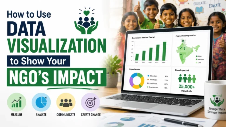
Data visualization for NGOs means presenting your program data (beneficiaries reached, funds used, outcomes achieved) as charts, infographics, maps, and simple visuals instead of long paragraphs of numbers. It helps readers understand your impact in seconds and builds trust faster than plain text ever can.
If your NGO’s annual report is a wall of text and tables, most readers will skim it and forget it. Data visualization for NGOs turns your numbers into pictures that people remember and trust, and that is exactly what donors, CSR partners, and government reviewers are looking for today.
What Is Data Visualization for NGOs?
Data visualization is the practice of presenting information visually, through bar charts, pie charts, maps, timelines, and infographics, so it is easy to read and remember.
For an NGO, this could be as simple as a bar chart showing how many children were vaccinated each year, or a map showing which districts your programs cover. The goal is not to make things look fancy. The goal is to help a busy donor or CSR officer understand your work without reading five pages first.
Most NGOs in India already collect strong data, attendance registers, beneficiary lists, expense sheets, survey forms. The problem is rarely a lack of data. The problem is that the data sits in files nobody opens.
Why NGOs Need Data Visualization to Show Impact
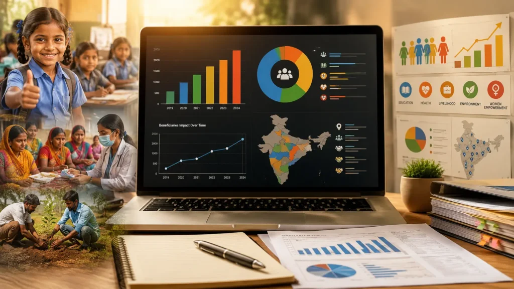
Trust is the biggest currency an NGO has. Donors, CSR teams, and government bodies like the FCRA department or NGO Darpan reviewers cannot see your ground work directly, so they judge you by what you show them.
- It builds credibility fast. A clear chart showing year-over-year growth in beneficiaries feels more honest than a paragraph claiming “we have grown significantly.”
- It respects the reader’s time. Most people spend a few seconds on a report page before deciding whether to keep reading.
- It supports compliance and audits. Visual summaries of fund utilization make it easier for auditors and 12A/80G reviewers to verify your work.
- It strengthens grant and CSR applications. Companies funding CSR programs often compare NGOs side by side, and clear visuals help you stand out.
- It makes social sharing easier. An infographic gets shared on social media far more than a PDF report ever will.
What Should an NGO Impact Report Include?
A strong NGO impact report usually answers a few core questions with numbers and visuals, not just narrative text.
- How many people or communities were reached, and where
- What changed for them (before and after the program)
- How funds were used, program-wise or state-wise
- Cost per beneficiary or cost per outcome, where relevant
- Growth or change compared to the previous year
- A few real stories or testimonials paired with the numbers
A good rule is to pair every major claim with one visual. If you say “we expanded to three new districts,” show a small map. If you say “more families completed the program this year,” show a simple bar chart.
Types of Data Visualization NGOs Can Use to Show Impact
Bar and Column Charts
Best for comparing numbers across years, districts, or program categories, such as beneficiaries served per year or funds spent per program.
Infographics
Best for annual reports, social media, and donor emails. Infographics combine icons, short numbers, and small charts into one shareable image.
Maps
Useful when your NGO works across multiple states or districts. A simple map with pins or shaded regions shows reach far better than a list of place names.
Timelines
Good for showing how your organization or a specific program has grown since it started, milestone by milestone.
Before-and-After Visuals
Photos or simple comparison charts showing a community’s situation before and after a program are some of the most persuasive visuals an NGO can use.
Icon Arrays (Pictographs)
A row of small human icons where each icon represents 100 people helps readers grasp scale instantly, better than a raw number like “12,400 beneficiaries.”
How to Turn Your NGO’s Data Into a Visual Story
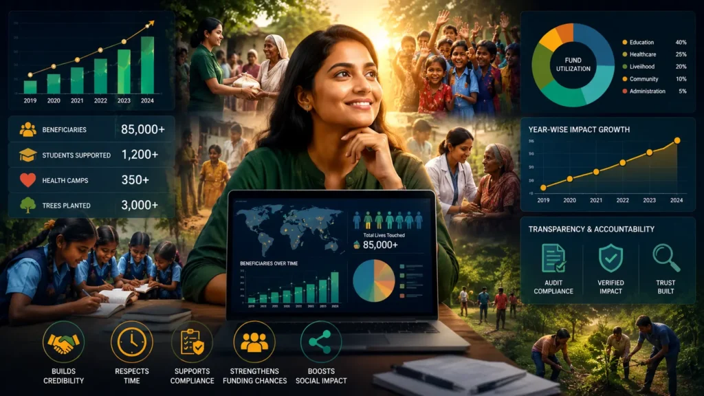
You do not need a data science team to do this well. A clear process matters more than expensive software.
- Start with one clear message. Decide what you want the reader to remember, such as “we doubled our reach this year,” before choosing a chart type.
- Choose the right chart for the data. Use bar charts for comparisons, line charts for trends over time, maps for geography, and pie charts sparingly, only when showing simple parts of a whole.
- Keep the design simple. Stick to two or three colors, avoid 3D effects, and remove any gridlines or labels that do not add meaning.
- Add context, not just numbers. A chart showing “500 women trained” means more when paired with a short line like “up from 320 last year.”
- Test with a non-expert reader. Show the visual to someone outside your organization and ask what they understood in five seconds.
- Update it regularly. Outdated statistics on your website or in your report damage trust faster than having no statistics at all.
Common Mistakes NGOs Make With Data Visualization
- Cramming too many statistics into one chart, making it hard to read
- Using too many colors or decorative elements that distract from the data
- Publishing charts without labels, sources, or dates
- Leaving old, outdated numbers live on the website for years
- Designing reports that look fine on a laptop but break on a phone screen
- Showing numbers without explaining what they mean for real people
Best Free and Low-Cost Tools for NGO Data Visualization
Small and mid-sized NGOs rarely need paid enterprise software. These tools cover most needs for reports, dashboards, and social media graphics.
- Canva offers easy templates for infographics, annual report pages, and social media impact graphics.
- Google Looker Studio connects to Google Sheets and builds free, live dashboards, useful for showing donors real-time program numbers.
- Flourish creates interactive charts, maps, and timelines that can be embedded directly on your website.
- Infogram is built specifically for infographics and reports, with a simple drag-and-drop editor.
- Tableau Public suits NGOs with larger datasets that want more advanced, interactive dashboards, free of cost.
How Data Visualization Builds Donor Trust
Donors give money to organizations they believe in, and belief is built through clarity, not just good intentions. When your impact is easy to see, a donor spends less time wondering if their contribution mattered and more time deciding to give again.
This matters even more for CSR funding in India, where companies must report their spending under the Companies Act, 2013, and prefer NGOs whose numbers are easy to verify and present internally. A clean chart in your report can make its way straight into a company’s own CSR presentation, which works in your favor.
Visual reporting also protects your NGO during due diligence. When a funder or auditor can quickly cross-check your visuals against your records, it signals that your organization has nothing to hide.
Frequently Asked Questions
What is the easiest way to show NGO impact with data?
The easiest way is to pick your three or four most important numbers, such as beneficiaries reached, funds utilized, and program growth, and turn each one into a simple bar chart or icon array. You do not need a full dashboard to start; even one honest, clear chart on your homepage or report cover page makes a difference.
Which chart type works best for NGO annual reports?
Bar charts work best for year-over-year comparisons, line charts work best for trends over several years, and maps work best for showing geographic reach. Pie charts should be used sparingly, only for showing how a budget is split across two or three categories.
How often should NGOs update their impact visuals?
At minimum, update your key statistics once a year alongside your annual report. NGOs running active fundraising campaigns or CSR partnerships often benefit from updating a simple dashboard quarterly, so numbers never look outdated to a returning donor.
Can small NGOs use data visualization without a designer?
Yes. Free tools like Canva and Google Looker Studio are built for non-designers and include ready-made templates. A small NGO with clean data in a spreadsheet can build a decent set of charts in an afternoon.
Do government or CSR donors expect visual reports?
Increasingly, yes. CSR teams often review dozens of NGO proposals at once, and a report with clear charts and summaries gets read more carefully than one with only dense text. Visual clarity does not replace compliance documents like 12A, 80G, or FCRA filings, but it makes your overall presentation stronger.
Good data visualization does not replace good program work, it simply makes that work visible to the people deciding whether to support it. If your NGO has strong outcomes but a report that is hard to read, that gap is usually easy to close with the right structure and design choices.
If you would like a second opinion on your NGO’s annual report, website statistics, or CSR presentation, our team at SAI NGO & Business Consultancy works with NGOs across India on exactly this kind of reporting and communication. Feel free to reach out whenever you are ready to talk it through.
Useful Links